Showing posts with label SAVE THE TECTONS. Show all posts

Wednesday, 16 January 2013

Evaluation


I feel my skills have developed a lot during the process of this project in context of film making and using the software Adobe Premiere Pro. However, if I had more time to work on it, I may have considered re-scripting and adding a few more subtle jokes to make it clearer of it being a parody. Also with availability to better audio equipment, I could have produced a sharper voice over with less back ground noise.

In terms for the print element, I used the software Adobe Photoshop, as this is where I feel more comfortable and have more experience in using. However from knowledge towards the end of the project, the outcome could have been improved by using the software Adobe Illustrator, therefore if I had more time I would have learnt how to use and re-created it on Illustrator. 

Tuesday, 15 January 2013

Displaying the Leaflet


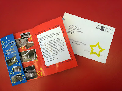
The way I have displayed the leaflet is that it looks as if the receiver has just opened their Tecton update mail. 


Friday, 11 January 2013

Tear Off Bookmark


As I was using a perforated edge for the bookmark inspired by the Matalan leaflet, I tested it out using a sewing machine, this technique does work, however the paper the leaflet is printed on was not suited to this technique and it ended up making the leaflet look low quality. 

The other ways leaflets create a removable section is to put a cutting line for the user to cut, I think is the idea that will be best for my design. 


Leaflet Further Development


I expanded on giving the Tecton human characteristics by scripting a message written in first person from the Tecton, this will be an aid in the humour. 

Where the leaflet is personalised (adopters name or nickname) I have used a different front to clearly show that it is just mass produced and not much care has gone into making the user feel like its personal to them, which is the opposite to the intentions to other leaflets but the outcome is the same.

From feedback about this stage, the name on the cover doesn’t have the same success as what it does within the message, so I have chosen to remove it. 

Sunday, 6 January 2013

Wallet Photo

I took the measurements of a credit card to ensure the wallet photo would fit in a standard size purse or wallet.


I chose to use this image of the bear ravine from when it was in use, as the structure was is in a quality state and attractive to show off. 


Friday, 4 January 2013

My Envelope Design


Envelope


I wanted to create a corporation envelope the leaflet would be sent in. I looked at a few different envelopes for inspiration. 


Saturday, 22 December 2012

Leaflet Development


To relate to the parody advert film I created, I wanted the print to hold some humour and I decided to do this by creating a tacky and over the top style but done in a somewhat professional technique.  Even though the cover is pretty simple n sleek, when the leaflet is opened there is a burst of childish colours, stars and random extras (Bookmark and wallet photo).

Thursday, 6 December 2012

Starting the Leaflet


I began putting the front cover of my leaflet together using the software Adobe Photoshop. As well as taking the elements of the Matalan leaflet, like personalisation and a tear off section, I liked the look of the title banner. However it starts to look too similar to the Matalan leaflet being a white banner so I will change it into just having white text. 

The way I began making the tear off bookmark, I feel looks boring and needs to be more fun and eye catching, so I’m going to redesign this section again. 

Wednesday, 28 November 2012

Matalan Leaflet

I received a Matalan Christmas leaflet in the post as I am a member; this gave me inspiration on the technique and design of the Tecton update.


Saturday, 24 November 2012

Print Piece

I wanted this part of the project to have a strong connection to the film element, therefore, in the ‘Adopt a Tecton’ advert I stated the adopter would receive a monthly Tecton update; I will now use this as a starting point.

Thursday, 15 November 2012

Displaying the Film

This piece would be displayed on a standard TV in a home setting to reflect being it a TV advert shown in-between programmes.


Wednesday, 14 November 2012

Save the Tecton's Advert


Transitions

Once I placed the video and sounds in the correct place, I had to then think about transitions to use. The most common transition used is ‘Cross Fade’, they also used this within the WWF adverts. I will used this transition for the majority of my film as it looks professional and flows well, it also it fits in with the clique.

Whereas, when showing the adoption pack, to heighten the tackiness and humour, I have chosen some cheesy flip transitions.

Monday, 12 November 2012

Clip of the Special Adoption Pack

I originally filmed the special adoption pack similar to in the ‘Adopt a Polar Bear’ advert, however as these products where the main parody element and what makes ‘WTF’ look like an actual charity they needed to be focused on more, for example, luxurious presentation and shown individually.

Monday, 5 November 2012

Text Within the Video

I looked into the typeface Future.
Future is a geometric sans-serif typeface designed in 1927 by Paul Renner. It is based on geometric shapes that became representative of visual elements of the Bauhaus design style of 1919–1933.

Lubetkins designs are characterized by clear geometric forms; therefor I chose to use this font to relate.


(Futura, Paul Renner, Creative Pro, Website, Viewed 5/11/2012. http://www.creativepro.com/article/the-bauhaus-designer-paul-renner)

Thursday, 1 November 2012

Adobe Premiere Pro.

After gathering footage of the bear ravine, I started to put together my video using Adobe Premiere Pro.


I used a local ‘Brummy’ to record the script as I thought I could create some humour with this. However after reviewing the video the voice did not fit or do the job intended, whereas the idea of recording it with a posh ‘BBC’ accent would make it more successful, as it being so professional and serious when the script has humour.

Tuesday, 23 October 2012

Special Adoption Pack

Within the adoption pack I will create a certificate, photos and a soft toy for the bear ravine Tecton.
 

Special adoption pack Certificate
I used Adobe Photoshop to create the certificate.
 
Special adoption pack Photos
I have included a picture of Lunetkin himself, a photo of the bear ravine in the 1930s and the architectural drawing of the enclosure. Along with some photos of the structure today, which I took on my visit.
 
Special adoption pack soft toy
Within the WWF adoption pack they give away a soft toy of the animal. As I thought creating a building as a soft toy was going to be hard, I chose to just create a soft toy pillow with an image of Lunetkin on, even though it will took quite tacky and a random gift to receive, this is where the humour will come from.
I created the soft toy using plain cream material, polystyrene balls and photo transfer paper.